
In this article, I will show how to plot heatmap with gmaps. First, we need to install gmaps using pip, from terminal or cmd you can type,
pip install gmapsfrom jupyter notebook cell,
!pip install gmapsWe also need pandas to read CSV files and get the amazing functionalities of pandas dataframe. For installing pandas with pip,
pip install pandasfrom jupyter notebook cell,
!pip install pandasFirst, we need to import the dependencies,
import pandas as pd
import gmaps
from IPython.display import display
We collected dataset from this source, https://www.kaggle.com/grebublin/coronavirus-latlon-dataset
We will use “CV_LatLon_21Jan_12Mar.csv” file for visualization.
data = pd.read_csv(“CV_LatLon_21Jan_12Mar.csv”)
df = pd.DataFrame(data)
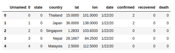
df.head()
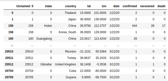
Now, look carefully at the dataset. This dataset has some latitude and longitude where corona spread is not confirmed. Look at the column “confirmed”, it has many zero values. we have to delete these rows where corona confirmed is zero.
mylist = [“confirmed”]
df2 = df[df[mylist].ne(0).all(1)]
df2
.ne(0) means not equal to zero. So df2 has all the latitude and longitude where the corona is confirmed.

gmaps.configure(api_key=””)
locations = df2[[‘lat’, ‘lon’]]
weights = df2[‘confirmed’]
fig = gmaps.figure()
fig.add_layer(gmaps.heatmap_layer(locations, weights=weights, max_intensity=100, point_radius=20.0))
fig
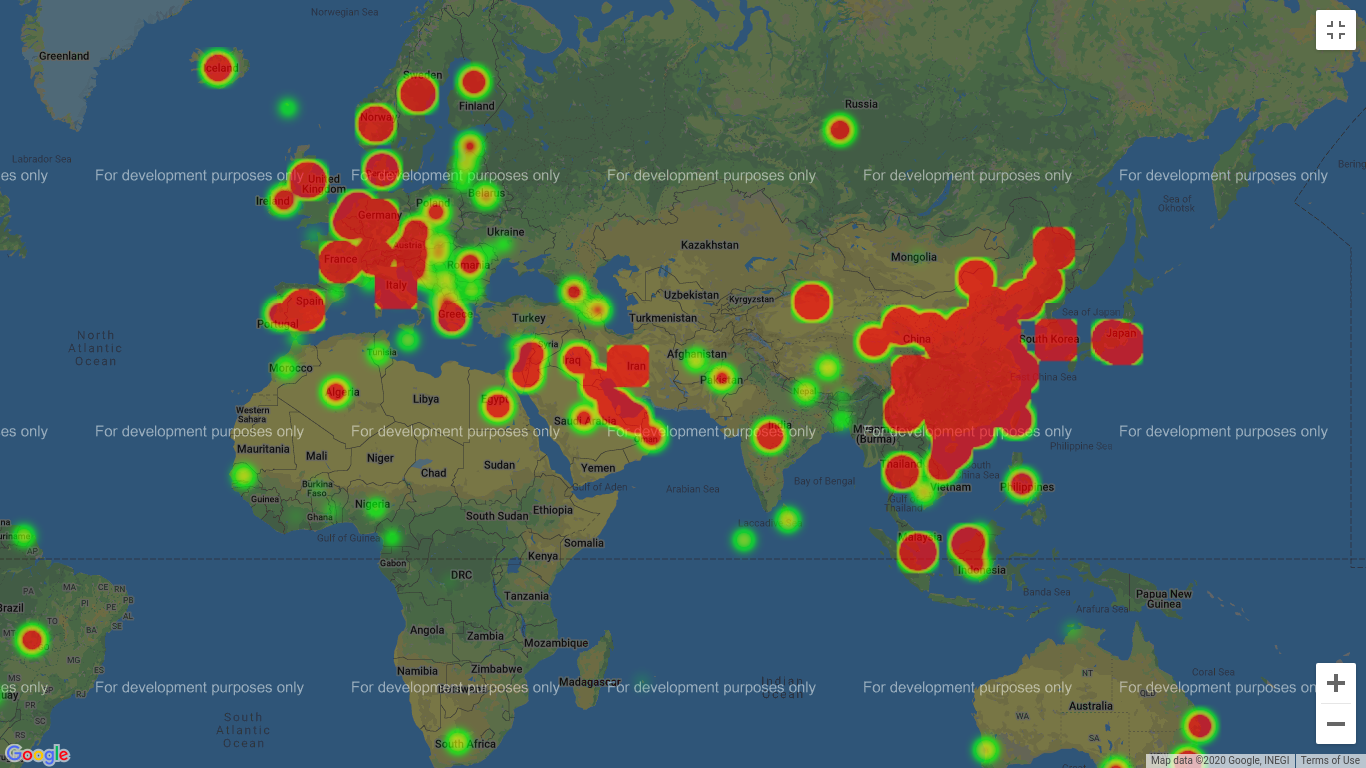
Here, API key is not given as we do not have any API key for google maps. Location selected from the “lat” and “lan” values from the df2 data frame. We also give the weights “confrimed” for the heatmap.
The intensity is given as 100, and points_radius given as 20. You can change the value to see the changes in heatmap.
I hope you enjoyed the tutorial. Let me know if you have any suggestions on my post in the comments.
N:B: If in jupyter notebook the figure is not shown you have to open the terminal and run the following commands,
jupyter nbextension enable --py gmaps
jupyter nbextension enable --py widgetsnbextension
0 Comments